Vacation Rental Design & Staging
Vacation rentals are marketed as a Home Away From Home sometimes, but really, are they? There are two sides to the Vacation Rental Design, and optimizing the property (to increase your bookings and rates) is what I aim to do.
As a vacation rental owner/operator, you want the listing to grab people. It has to look pulled together and location specific. You have the listing photos, and reviews, and that is where people start. If the pics don’t show the property in a positive light, people will scroll to the next one. If the reviews are sub-par for any reason, they may keep scrolling as well.
To grab your potential renters, you need those pics to shine. A color scheme you might not want to live with every single day in your own home, can work well in a vacation rental. A wall of bold wallpaper that you might tire of at home after a while, is fun and stunning in a rental. A pink neon sign that says “It’s all happening!” is probably not something you’d hang in your living room, but in the rental entryway, or living room? Super fun and “Instagrammable”. That’s why I say that AirBnB’s and VRBO’s are not exactly a Home Away From Home.

On the flip side, what you do need to have in terms of that “at home” feeling is the utility items. You’re on your way to a 3 star review if you didn’t stock enough silverware in the vacation rental, and the people got sick and tired of washing forks every couple of hours. Depending on how many people you say the place will sleep, you need to have the amenities for that amount of people covered, from forks to blankets to shampoo.
Location specificity is important to me. When I stay somewhere, I want it to feel like I am AWAY. For instance I have a friends birthday coming up in February and we are booking a cabin in the mountains near a lake. I definitely weighed in on her options, because I don’t want to stay in some Modern Farmhouse with slightly too modern of a look, when I am in the woods. I want this place to feel like we are in a Rustic Cabin. For instance if I were designing a Cabin in the Woods Vacation Rental, I’d include touches like silverware that looks like twigs, lots of plaid and cuddly fabrics, artwork from the local area and some sort of cute sign that calls out the location. Nothing gets posted more than a cute sign that calls out your location. People love it.


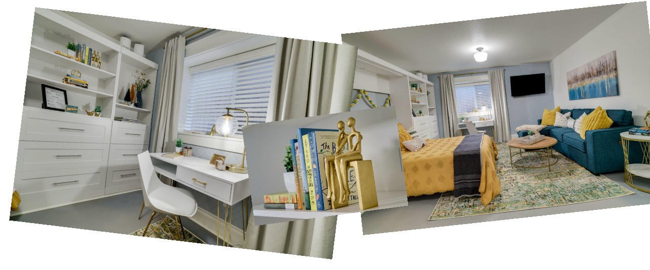
I recently did an AirBnB in Portland Oregon. We used a green/yellow palette to call in the colors of the local foliage, I included several Portland specific artwork, went shopping on site when up there to do the installation to grab anything local that worked. But, I was also very careful to make sure that the Murphy Bed and the Sleeper Sofa would not interfere with each other, that there was ample dining plates and utensils, books on the shelves that not only matched the color scheme, but were also actual good books to read (we got very lucky at the North Portland Goodwill, they had so many brand now looking books for so cheap, that were current and popular, recognizable titles, and lots of stuff that worked with the color scheme).

There is an entire science to Vacation Rental design and I’ve studied and worked it. If you want to increase your presence, command higher rates and have a fully booked calendar, I’d be happy to do a re-design on your vacation rental, either starting with what you have currently and building on it, or starting over.
My specialty is “making things work”!